Wireframing in Figma is easy and an important step in the design process where a skeletal blueprint of a digital interface is created. It outlines the basic structure and layout of a webpage or application, focusing on the arrangement and interaction of elements without getting into detailed design aspects like colors, fonts, or graphics. Essentially, wireframes serve as the visual guide to a project, helping to communicate the layout, functionality, and flow of the user interface. Figma provides powerful tools that make wireframing straightforward and collaborative. This guide will walk you through creating your first wireframe in Figma, covering every aspect in detail. You can also check the quick guide tutorial on figma basics.
Wireframing in Figma Key Components
Structure: Defines the placement of elements such as headers, footers, navigation bars, and content areas.
Layout: Specifies the spatial arrangement and alignment of interface components.
Content Hierarchy: Organizes content by importance, ensuring that key information is easily accessible.
Functionality: Maps out the interactive elements, such as buttons, links, and forms, showing how users will navigate through the interface.
Annotations: Provide additional details or instructions about specific components, interactions, or behaviors.
Let’s design the first basic wireframe project
Setting Up Your Project
Step 1: Open Figma and Create a New File
Accessing Figma: Go to the Figma website or open the Figma desktop app.
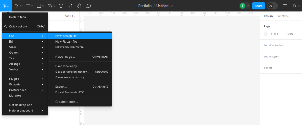
Creating a New File: On the home screen, click on the New File button to create a new design file. You can also create a new file from the menu by selecting File > New File.
Step 2: Set Up Your Canvas
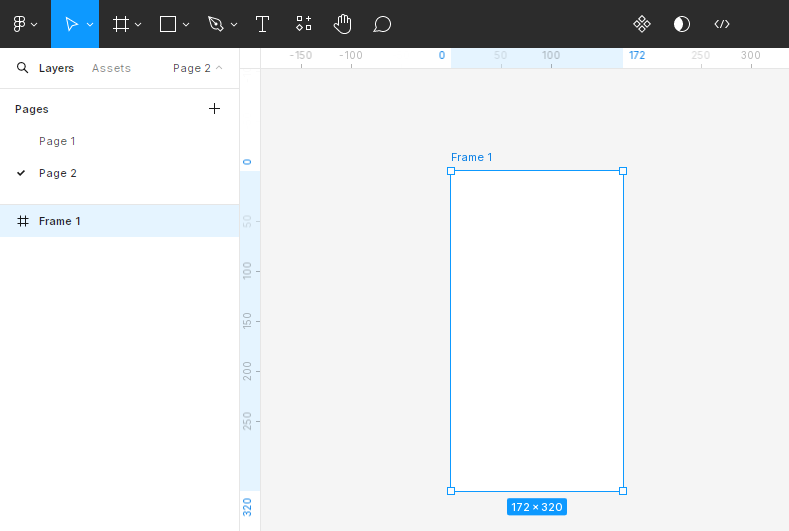
Choosing Dimensions: Determine the dimensions of your wireframe based on the device or screen size you’re designing for. Common sizes include:
Desktop: 1440×1024 pixels
Tablet: 768×1024 pixels
Mobile: 375×812 pixels (iPhone X)
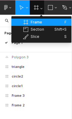
Creating a Frame: Use the Frame Tool (F) to create a frame on the canvas with these dimensions. Frames in Figma can be used to represent screens, artboards, or any bounded area in your design.
Step 3: Save Your Work
Saving the File: Figma automatically saves your work in real time. However, it’s good practice to name your file and organize it in a project folder. Click on the file name at the top left and enter a descriptive name.

Key Elements of a Wireframe
Headers and Footers: Define the top and bottom sections of your page, often containing branding and navigation links.
Navigation Bars: Indicate menu items and links that help users navigate the site.
Content Areas: Placeholders for text, images, and other content.
Buttons and Call-to-Actions: Simple rectangular shapes to represent interactive elements.
Forms and Input Fields: Outline areas for user inputs like text fields, checkboxes, and radio buttons.
Step 4. Creating the Layout
Creating the Header:
Select the Rectangle Tool (R) from the toolbar.
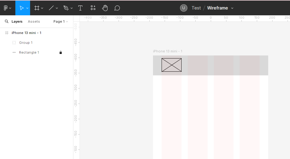
Click and drag a rectangle at the top of your mobile frame to represent the header. Adjust the size in the Properties Panel.

Adding Placeholder Text:
Use the Text Tool (T) to add a title or logo placeholder inside the header. You can type “App Name” or use a simple rectangle to represent where the logo will go.
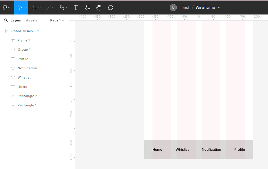
Designing the Nav Bar:
Draw a rectangle below the header for the navigation bar using the Rectangle Tool.
This will visually separate the navigation from the main content.
Adding Menu Items:
Use the Text Tool to add icons or text elements inside the navigation bar to represent menu items like “Home,” “Profile,” “Messages,” and “Settings.”
Space them evenly and use the Properties Panel to adjust the size and alignment.
Creating the Main Content Area:
Draw a large rectangle below the navigation bar to serve as the main content area. This is where the bulk of your app content will be placed.
Adding Sections:
Inside this area, use smaller rectangles to represent different sections such as posts, images, or buttons. For example, create a series of rectangles for a social media feed layout with placeholders for images and text.
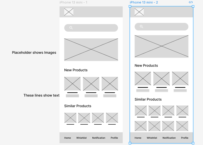
Step 5: Adding Detail to Your Mobile Wireframe
Insert Placeholders for Text and Images
Use the Text Tool (T) to add headings, subheadings, and body text placeholders.
For example, add “Heading” for major sections and “Lorem ipsum” for body text.
Adding Image Placeholders:
Draw rectangles with the Rectangle Tool (R) to represent image placeholders.
Label them with “Image” or use a crossed box to indicate an image area.
Create Buttons and Interactive Elements
Designing Buttons:
Draw small rectangles to represent buttons. Use the Properties Panel to adjust the size and position.
Add text labels on the buttons using the Text Tool, such as “Submit,” “Read More,” or “Sign Up.”
Styling Buttons:
While wireframes are low-fidelity, you can add subtle styling like rounded corners to indicate button shape.
Use the corner radius option in the Properties Panel.
Design Forms and Input Fields
Draw rectangles for text input fields.
Add labels next to them using the Text Tool to indicate what each field is for, such as “Name,” “Email,” and “Password.”
Adding Checkboxes and Radio Buttons:
Use smaller rectangles or circles to represent checkboxes and radio buttons.
Group these with their respective labels.
Step 6 Organizing and Grouping Elements
Use Layers and Groups
Layers Panel:
Organize your design elements in the Layers Panel on the left.
Drag elements within the panel to change their order or hierarchy. For example, keep your header elements grouped for easy access.
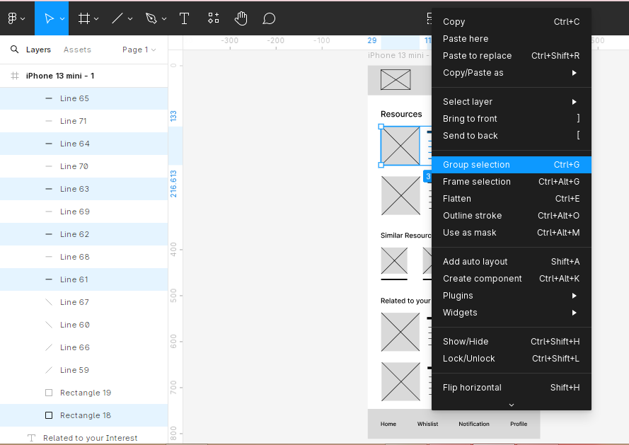
Grouping Elements:
Group related elements together by selecting them and pressing Ctrl + G (Cmd + G on Mac). Groups help keep your design organized and make it easier to move or edit multiple elements at once.
Step 7. Adding Annotations
Use Comments for Feedback
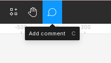
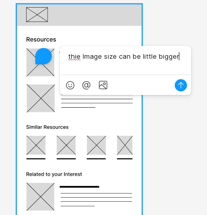
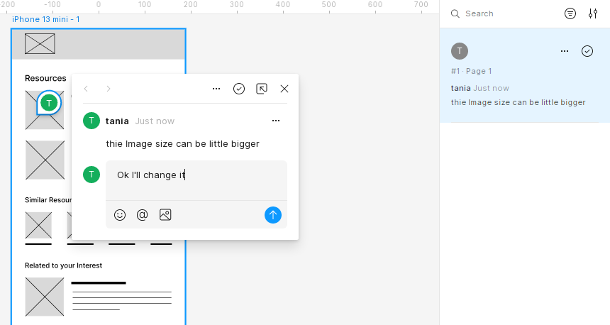
Adding Comments: Click on the Comment Tool in the toolbar to add comments directly on the canvas. Comments are useful for team feedback and discussions.
Replying to Comments: Team members can reply to comments, providing additional insights or questions. Comments can be resolved once the feedback has been addressed.
Step 8. Sharing Your Wireframe
Sharing Options: Click the Share button in the top-right corner of the screen. Enter the email addresses of your collaborators and set their permission levels (View, Edit).


Link Sharing: You can also share a link to your wireframe. Adjust the link settings to control who can view or edit the file.
Export Your Wireframe
Selecting Elements: Select the elements or frames you want to export. You can select individual elements or the entire frame.
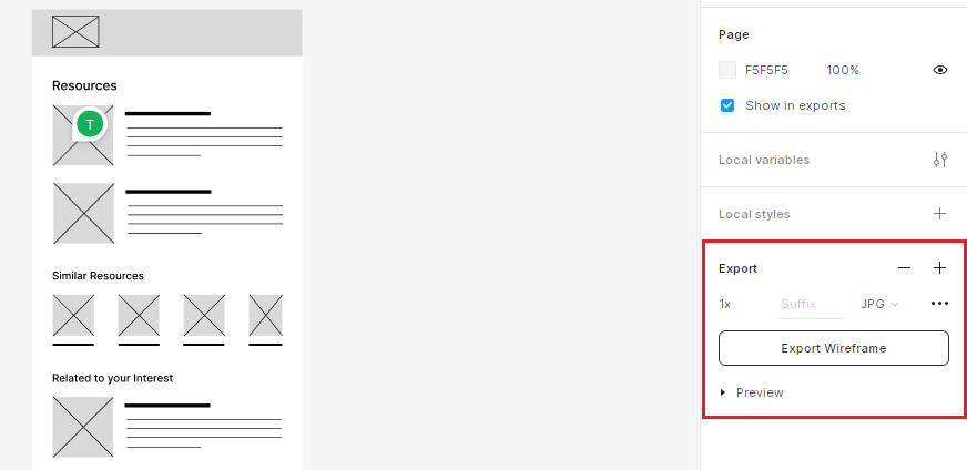
Exporting Options: In the Properties Panel, click the Export button. Choose the format (PNG, JPG, SVG, PDF) and resolution. Click Export to save the files to your computer.
Watch a Quick Video Tutorial on Wireframing
Step 9. Refining Your Wireframe
Wireframing is an iterative process. Gather feedback from stakeholders and make necessary adjustments to your wireframe. Use Figma’s version history to track changes and revert to previous versions if needed.
Gather Feedback
Sharing for Feedback: Share your wireframe with team members and stakeholders. Collect feedback through comments or collaborative discussions.
Review Sessions: Conduct review sessions where stakeholders can provide verbal feedback while interacting with the wireframe.
Make Adjustments
Iterating on Design: Refine your wireframe based on the feedback received. Adjust layouts, change elements, and add new components as necessary.
Version Control: Use Figma’s version history to manage different iterations of your wireframe. You can view past versions and revert to them if needed.
Validate User Flows
Testing User Flows: Ensure that the user flows are logical and intuitive. Check that navigation, forms, and buttons function as expected.
Prototyping: Create simple prototypes to test interactions and flows. This can help identify any usability issues early in the process.
Tips for Effective Wireframing
Tip 1: Keep It Simple
Focus on the structure and layout without getting bogged down by design details. Use simple shapes and placeholders to represent elements.
Tip 2: Use Consistent Spacing
Maintain consistent spacing between elements for a clean and organized layout. Use Figma’s alignment and distribution tools to ensure even spacing.
Tip 3: Utilize Grids and Guides
Use grids and guides to help align and organize elements. This ensures a consistent layout and helps in creating a visually balanced wireframe.
Tip 4: Label Everything Clearly
Clearly label all elements in your wireframe, including buttons, forms, and sections. This makes it easier for stakeholders to understand the layout and functionality.
Tip 5: Prioritize Content Hierarchy
Establish a clear content hierarchy by using different font sizes and weights for headings, subheadings, and body text. This helps in guiding the user’s attention to important elements.
Tip 6: Use Pre-made Components
Utilize Figma’s built-in UI kits and pre-made components to speed up the wireframing process. These components can be customized to fit your design needs.
Tip 7: Collaborate with Your Team
Involve your team early in the wireframing process. Use Figma’s collaboration features to gather feedback and make adjustments in real time.
Tip 8: Test with Real Content
Where possible, use real content instead of lorem ipsum to get a better sense of how the design will look and function. This can highlight potential issues early on.
Tip 9: Keep Iterating
Wireframing is an iterative process. Regularly update and refine your wireframes based on feedback and testing to ensure they meet user and stakeholder needs.
Conclusion
Creating a wireframe in Figma is an important step in the design process, allowing you to plan and structure your web page or mobile app effectively. By following this step-by-step guide, you can create clear and organized wireframes that serve as the foundation for detailed design and development. As you become more comfortable with Figma, you can explore its advanced features to enhance your wireframing process further.