Figma Auto Layout is a powerful feature that simplifies the process of creating dynamic and flexible designs. It allows UI/UX designers to easily resize and rearrange elements within frames, making it ideal for building responsive interfaces, components, and layouts. In this extensive tutorial, we’ll dive deep into mastering Auto Layout in Figma, providing a complete step-by-step guide to help you leverage its full potential.
1. Understanding Figma Auto Layout
AutoLayout is a layout system in Figma that automatically adjusts the size and position of elements within a frame based on predefined rules. Key benefits include:
Flexibility: Elements resize dynamically, adapting to changes in content or container size.
Efficiency: Simplifies the design process, reducing the need for manual adjustments.
Consistency: Ensures consistent spacing and alignment between elements.
2. Getting Started with Auto Layout
Enable AutoLayout
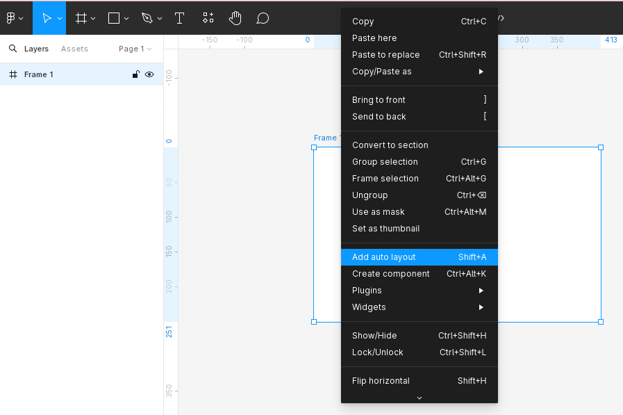
Selecting a Frame: Choose a frame that will contain the elements you want to apply Auto Layout.
Enabling AutoLayout: In the right-hand panel, click on the Auto Layout button (or press Shift + A) to activate AutoLayout for the selected frame.
Adding Elements
Inserting Elements: Drag and drop or draw elements (e.g., text layers, shapes) into the frame with Auto Layout enabled.
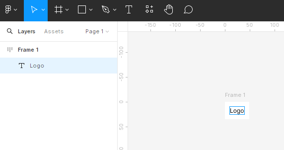
Arranging Elements: Position elements within the frame, and AutoLayout will automatically adjust their alignment and spacing.

3. Configuring Auto Layout Settings
Direction
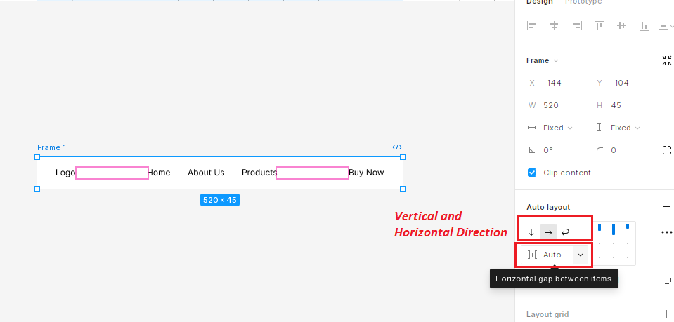
Horizontal Layout: Elements are arranged from left to right. Vertical Layout: Elements are arranged from top to bottom.
Spacing
Auto Spacing
“Auto” spacing dynamically adjusts the spacing between elements to equally distribute them within the frame. This is useful for maintaining uniform spacing when resizing the frame.
Fixed Spacing
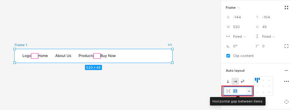
“Fixed” spacing keeps a constant distance between elements, regardless of frame resizing, this means when you resize the frame the elements do not take full-frame width. This is useful when you want consistent spacing.
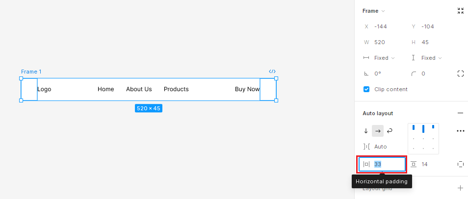
Padding
The padding adds space around the edges of the frame to create margins.
4. Nesting Auto Layout Frames
Create nested frames within frames with AutoLayout enabled to build more complex layouts.
Flexibility: Each nested frame can have its own AutoLayout settings, allowing for greater flexibility.
Suppose you want to create a complex layout with a header section that contains a logo on the left, navigation links in the center, and a button on the right.
Create a new frame, and apply AutoLayout to this frame (Shift + A).
Set the direction to horizontal (so that elements inside will be aligned in a row).
Create Nested Auto Layout Frames
Left Section (Logo):
Create a frame for the logo. Apply AutoLayout to this frame.
Add your logo image or text inside this frame.
Center Section (Navigation Links):
Create another frame for navigation links. Apply AutoLayout to this frame.
Add text elements or buttons for each navigation link inside this frame.
Right Section (Button):
Create a frame for the button. Apply AutoLayout to this frame.
Add your button inside this frame.
Adjust Spacing and Alignment
In the Auto Layout settings, adjust the spacing between items and padding to achieve the desired layout.
Ensure that each nested frame (left, center, right) has appropriate constraints set to align correctly within the main frame.

5. Creating Responsive Designs with Auto Layout
Responsive Design: Use Autolayout to create responsive designs that adapt to different screen sizes and orientations.
Breakpoints: Define breakpoints within frames to accommodate changes in layout at specific screen sizes.
Setting Constraints: Define constraints to control how elements resize within frames.
Left/Right Constraints: Elements stretch horizontally based on the defined constraints.
Top/Bottom Constraints: Elements stretch vertically based on the defined constraints.
Best Practices and Tips
Tip 1: Start Simple
Basic Layouts: Begin with simple layouts to familiarize yourself with Auto Layout before tackling more complex designs.
Tip 2: Plan Ahead
Layout Structure: Plan the structure of your design and define Auto Layout settings before adding elements.
Tip 3: Experiment and Iterate
Exploration: Experiment with different Auto Layout settings and configurations to find the optimal layout for your design.
Iterative Design: Iterate your designs based on feedback and testing, refining Auto Layout settings as needed.
Tip 4: Documentation and Naming Conventions
Clarity: Use clear naming conventions and documentation to communicate Auto Layout settings and intentions to collaborators.
Conclusion
Mastering Auto Layout in Figma equips designers with the tools to create dynamic, flexible, and responsive designs effortlessly. This comprehensive tutorial guides you through the full potential of Auto Layout, enabling you to streamline your design process, ensure consistency, and provide exceptional user experiences across all devices and screen sizes. By applying these principles, you can enhance your workflow, maintain a cohesive design system, and adapt seamlessly to various design challenges.