Figma Components and variants are powerful features that streamline the design process by enabling the creation of reusable and customizable UI/UX design elements. In this guide, we’ll explore how to use components and variants effectively to optimize your design workflow and maintain consistency across projects. You can also go through a quick guide of Figma to enhance your design skills.
Understanding Components and Variants
Components are reusable design elements that can be used multiple times within a project. They can range from simple UI elements like buttons and icons to more complex structures like navigation bars and cards.
Variants are variations of a component that allow for different states, styles, or sizes. For example, a button component may have variants for different colors, sizes, or hover effects.
Creating Components in Figma
1. Design the Component
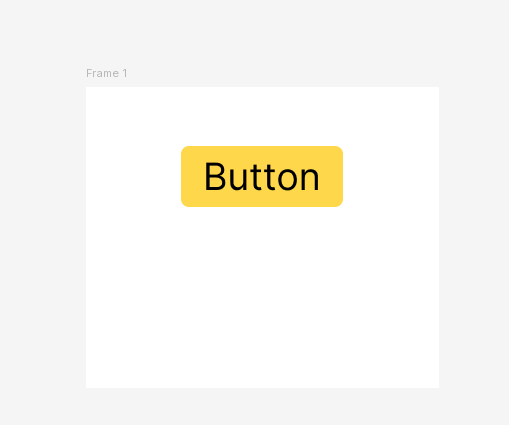
Start by designing the individual element you want to turn into a component, such as a button or icon.
Ensure that the design is complete and that all elements are properly aligned and grouped.
2. Create the Component
Select the element or group of elements.
Right-click and choose “Create Component” from the context menu, or press Cmd/Ctrl + Alt + K.


The selected elements will be converted into a component, indicated by a purple frame around them.

3. Using Components in Your Designs
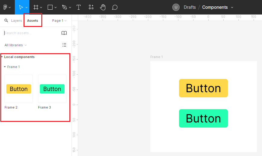
To use a component in your design, simply drag it from the assets panel onto your canvas.
You can also use the component menu (Cmd/Ctrl + E) to search for and insert components.
4. Editing Components
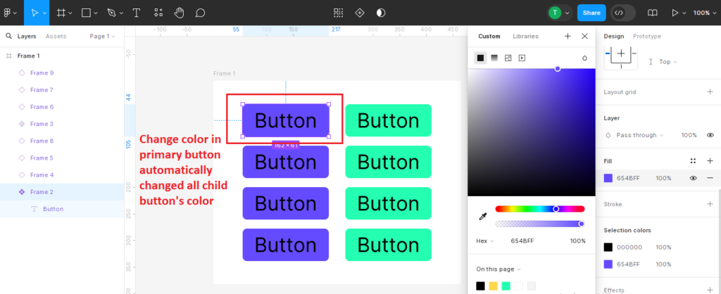
Click on a component to make changes to the component’s design, such as text or color adjustments.
All instances of the component will update automatically to reflect the changes.
5. Creating Variants in Figma
Start by designing the different variations of your component, such as different colors, sizes, or states.
Ensure that each variant is distinct and clearly labeled.
Create the Variants
Select the component on your canvas.
In the properties panel, click the “+” button next to the component’s name to “create a variant”.
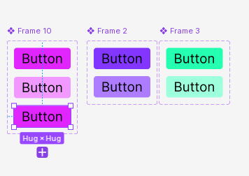
Duplicate the component within the Variant container to create multiple variants. For example, you might create one variant for the default state and another for the hovered state. Name each variant and configure its properties, such as color or size.

I applied variants to three buttons, changing the color of the second button.

Add variants by clicking the plus button and adjust the properties as needed.
6. Using Variants in Your Designs
Drag the component onto your canvas as usual.
Use the properties panel to select the desired variant from the dropdown menu.

7. Set Up Prototype Interactions
Switch to Prototype Mode.
Go to the top right of Figma and switch from “Design” mode to “Prototype” mode.
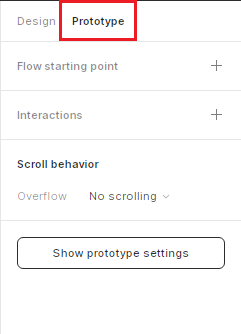
Create Interactions
Select the default state of your component and drag the prototyping handle (blue dot) to the hover state variant.
In the interaction details panel, set the trigger to “While hovering” and the action to “Change to” the hover state variant.

You can also add an interaction for the click state by dragging the prototyping handle from the hover state to the click state variant and setting the trigger to “On click.”

Drag the component from the Assets panel to the main frame.
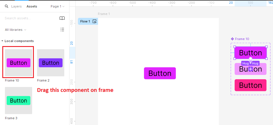

8. Test Your Prototype
Play the Prototype
Click the “Play” button in the top right corner of Figma to preview your prototype.
Interact with your component to see the color change based on the interactions you set up.
Example Scenario
Let’s say you’re designing a button that changes color from purple (default) to light purple (hover) and then to black (click).
Create the default button with a purple fill and convert it into a component.
Add two more variants:
1. One with a light purple fill for the hover state.
2. One with a black fill for the click state.
Set up prototype interactions:
Default to hover: Trigger “While hovering” → Action “Change to hover variant.”
Hover to click: Trigger “On click” → Action “Change to click variant.”
Figma Components and Variants Video Tutorial
Best Practices and Tips
Tip 1: Keep Components Simple
Components should be simple and focused on a single purpose to maximize reusability.
Tip 2: Name Components Descriptively
Use clear and descriptive names for your components to make them easier to find and use.
Tip 3: Document Component Usage
Create documentation or guidelines for how components should be used to maintain consistency across projects.
Tip 4: Use Variants
Use variants to represent meaningful variations of a component, such as different states or styles.
Tip 5: Collaborating with Components and Variants
Share component libraries with team members or collaborators to ensure consistency across projects.
Use Figma’s version history to track changes and updates to components.
Conclusion
Components and variants in Figma are powerful tools for creating reusable and customizable design elements. By following this guide and incorporating components and variants into your workflow, you can streamline your design process, maintain consistency across projects, and collaborate more effectively with team members.