Wireframing is a critical step in the design process for digital products, such as websites, mobile apps, and software applications. It serves as a visual guide that represents the skeletal framework of a digital interface. This article gets into the complexity of wireframing, its importance, methodologies, tools, and best practices.

What is Wireframing?
Wireframing is the process of creating a simplified visual representation of a user interface. These wireframes, akin to blueprints, outline the basic structure and layout without the distraction of colors, fonts, or images. They focus on functionality, user flow, and content placement, providing a clear map for developers and designers to follow.
Importance of Wireframing
Clarity and Focus: Wireframes help to define the layout and interaction of the user interface early in the design process. By stripping away aesthetic elements, stakeholders can concentrate on core functionality and user experience.
User Experience (UX): Wireframes prioritize usability, helping to ensure that the final product is user-friendly. They allow designers to map out the user journey, making it easier to identify potential pain points and areas for improvement.
Cost-Efficiency: Identifying and addressing issues in the wireframing stage is significantly less costly than making changes after development has begun. Wireframes facilitate early feedback and iteration, saving time and resources.
Collaboration and Communication: Wireframes act as a common language between designers, developers, and stakeholders. They provide a visual guide that everyone can understand and contribute to, fostering better collaboration and communication.
Types of Wireframes: A Detailed Guide
Wireframing is a vital part of the design process, offering a visual representation of a digital product’s structure. Depending on the project’s stage and the level of detail required, wireframes can be categorized into three main types: low-fidelity, mid-fidelity, and high-fidelity. Let’s explore each type in depth to understand their purposes, features, and how they contribute to the overall design process.
Low-Fidelity Wireframes
What Are They?
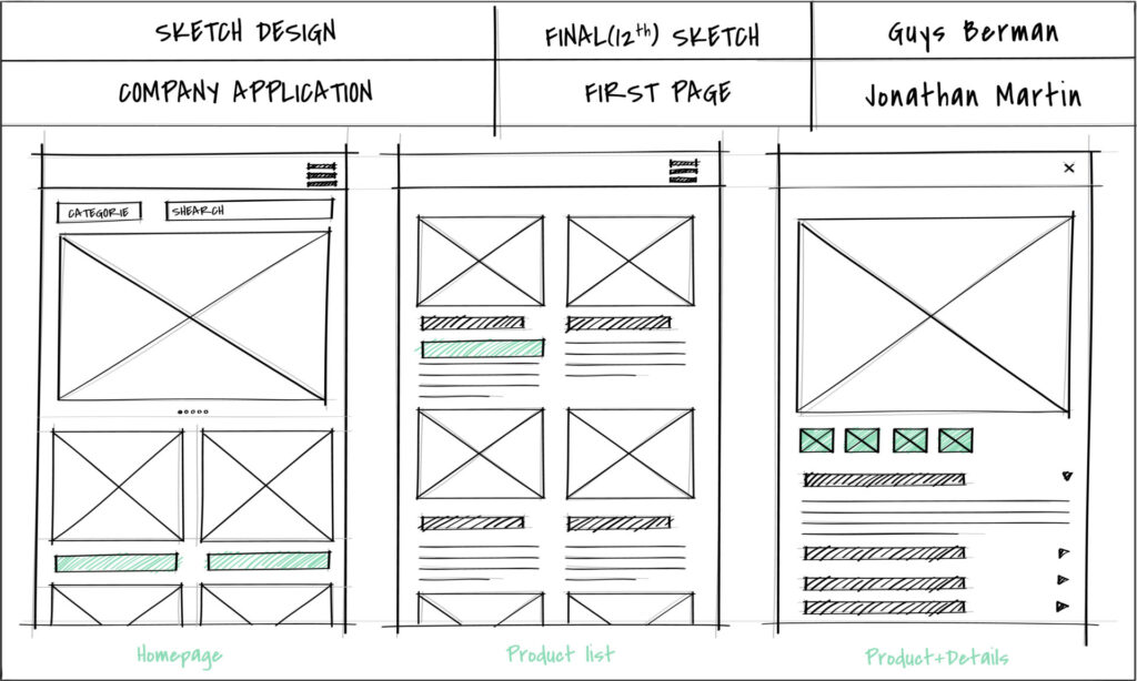
Low-fidelity wireframes are the simplest form of wireframes. They are often basic sketches, either hand-drawn or created using rudimentary digital tools. These wireframes focus on the overall layout and structure without delving into detailed design elements.

Characteristics
Simplicity: Low-fidelity wireframes are straightforward and uncomplicated. They use basic shapes and lines to represent different elements of the interface.
Lack of Detail: There are no detailed design elements like colors, images, or exact spacing. They often use placeholders like rectangles for images and lines for text.
Focus on Layout: The primary goal is to establish the basic layout and arrangement of content, such as the placement of headers, footers, navigation menus, and main content areas.
When to Use
Initial Brainstorming: Ideal for the early stages of a project when you’re brainstorming ideas and concepts.
Rapid Prototyping: Useful for quickly sketching out ideas to visualize different layouts and gather initial feedback.
Team Discussions: Helps facilitate discussions among team members and stakeholders about the overall structure and user flow without getting bogged down by details.
Example
Imagine sketching a homepage on a piece of paper with boxes representing the header, navigation menu, main content area, and footer. This gives a clear, quick visual of the page’s basic structure without any design details.
High-Fidelity Wireframes
What Are They?
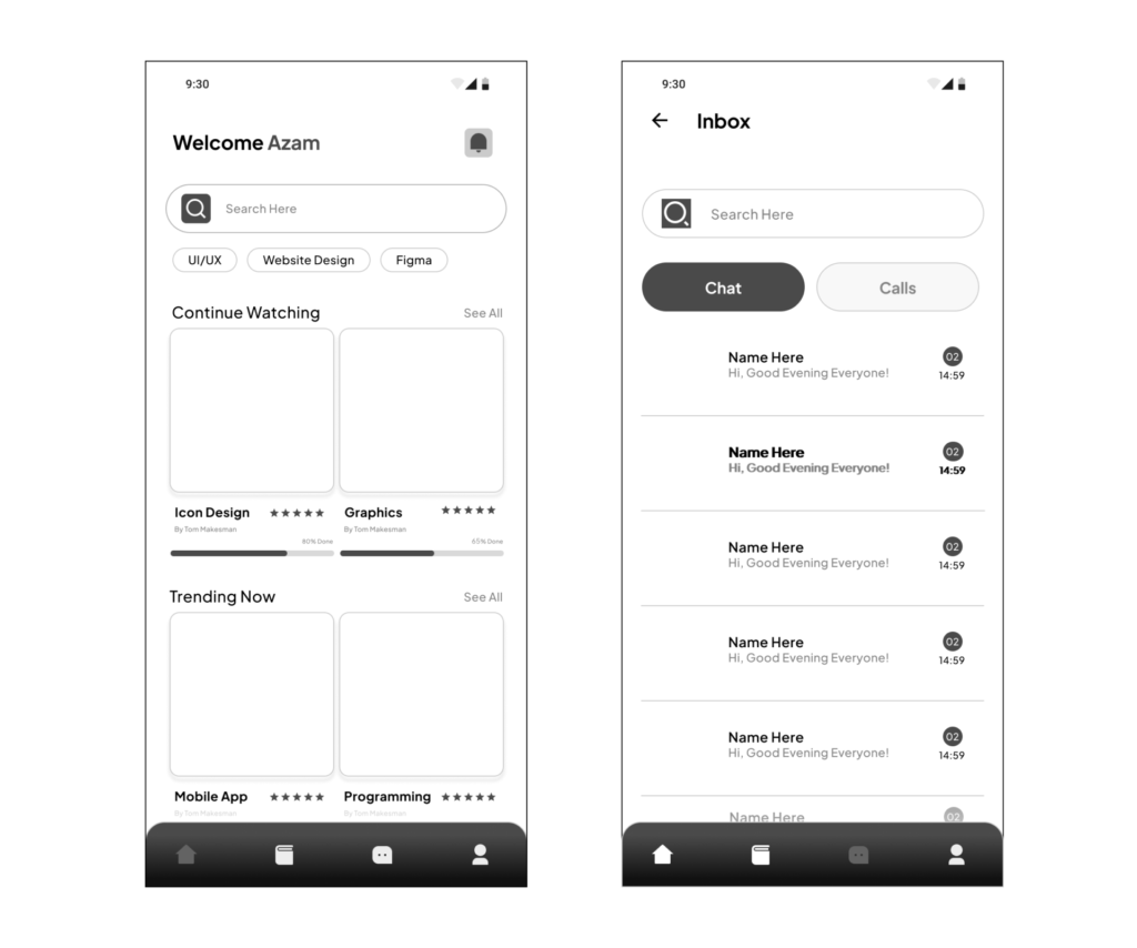
High-fidelity wireframes are the most detailed type, closely resembling the final design. They include exact dimensions, fonts, and sometimes color indications. These wireframes may also incorporate basic interactivity to help visualize the user experience more clearly.

Characteristics
Detailed Design Elements: High-fidelity wireframes incorporate specific design elements such as exact typography, spacing, and sometimes color schemes.
Precision: Every element is placed with precision, reflecting the final product’s design and layout closely.
Interactivity: Often includes interactive features like clickable buttons, hover effects, and navigation flows, providing a near-realistic experience of the interface.
When to Use
Final Design Approval: Ideal for getting final approval from stakeholders before moving into the development phase.
Developer Handoff: Provides detailed guidance to developers, ensuring they understand the exact design specifications and interactions.
User Testing: Allows for thorough user testing to refine interactions and ensure the design meets user needs and expectations.
Example
Using a tool like Adobe XD or Sketch to create a wireframe that includes specific fonts, detailed icons, precise spacing, and interactive elements like forms that can be filled out and buttons that simulate real navigation.
Wireframing Methodologies
Sketching: The simplest form of wireframing, sketching involves drawing interfaces on paper or a whiteboard. This method is quick and encourages creative brainstorming.
Digital Wireframing: Using specialized software tools to create wireframes digitally. This method allows for easy editing, sharing, and iteration.
Prototyping: Advanced wireframes that include interactive elements to simulate user interactions. Prototyping tools enable designers to create clickable wireframes that provide a more realistic preview of the final product.
Wireframing Tools
Several tools cater to different needs and stages of wireframing:
Sketch: Sketch is a popular design tool known for its intuitive interface and powerful features for creating detailed wireframes and prototypes.
Adobe XD: Adobe’s tool for UI/UX design and prototyping, offering robust wireframing capabilities along with collaborative features.
Figma: A web-based Figma tool that supports real-time collaboration, making it ideal for team projects. It allows for both wireframing and prototyping.
Balsamiq: Known for its low-fidelity wireframing, Balsamiq mimics the experience of sketching on paper but in a digital environment.
Axure RP: A comprehensive tool for creating high-fidelity wireframes and prototypes with advanced interactivity.
InVision: Invision focuses on prototyping and collaboration, allowing designers to create interactive wireframes and gather feedback easily.
Best Practices for Effective Wireframing
Understand the User: Begin with thorough user research to understand the needs, behaviors, and pain points of your target audience. This user-centered approach will guide your wireframing process.
Start Simple: Begin with low-fidelity wireframes to map out the basic structure and user flow. Don’t worry too much about the details for now.
Iterate Often: Wireframing is an iterative process. Continuously refine and improve your wireframes based on feedback from stakeholders and user testing.
Focus on Functionality: Ensure that the wireframe clearly communicates the intended functionality of each element. Use annotations to provide additional context if needed.
Consistency is Key: Maintain consistency in layout and design patterns to create a cohesive user experience. This includes using standard conventions for navigation, buttons, and other interface elements.
Collaborate and Communicate: Involve stakeholders from various disciplines (design, development, marketing, etc.) in the wireframing process. Use collaborative tools to gather input and ensure alignment.
Test Early and Often: Use wireframes for early user testing to validate assumptions and gather insights. This helps to identify usability issues before moving into more detailed design and development phases.
Conclusion
Wireframing is a foundational step in the design and development of digital products. It serves as a blueprint that guides the entire project, ensuring that functionality, user experience, and design are aligned from the outset. By focusing on structure and user flow, wireframes help teams create user-friendly interfaces efficiently and effectively. Embracing best practices and the right tools can upgrade the wireframing process, leading to more successful and impactful digital products.